"Yu" Bag

The Yu Bag draws inspiration from my personal experience with trypophobia, reinterpreting the anxiety of clustered holes into delicate, organic forms. The flowing, ethereal movement of jellyfish and their tentacles informed the silhouette and surface texture. I also looked to Nendo’s Vase project for its minimalist yet nature-inspired structure—transforming functional design into something poetic. Together, these elements shaped a project that feels both raw and refined, connecting the uncanny beauty of nature with human emotion.

Mood Board

Building on the fluidity and translucency of jellyfish forms, I began exploring how organic irregularity could be translated into structure. This led me to experiment with materials that are soft yet responsive—able to hold shape while still conveying movement. As the concept developed, my focus shifted toward more technical, line-driven compositions. Influenced by architectural geometry and digital fabrication aesthetics, I investigated repetition, layering, and precision as tools to reflect the controlled chaos found in nature. These elements laid the foundation for a bag that merges softness with structure, emotion with engineered clarity.

Inspiration Board
Zaha Hadid
Inspired by Zaha Hadid’s fluid and futuristic architecture, I began exploring how continuous lines and sculptural curves could shape the Yu Bag. Her ability to merge organic flow with structural clarity influenced my approach to form, guiding experiments with layered construction, contour lines, and dynamic surface treatments that give the bag a sense of movement and spatial depth.
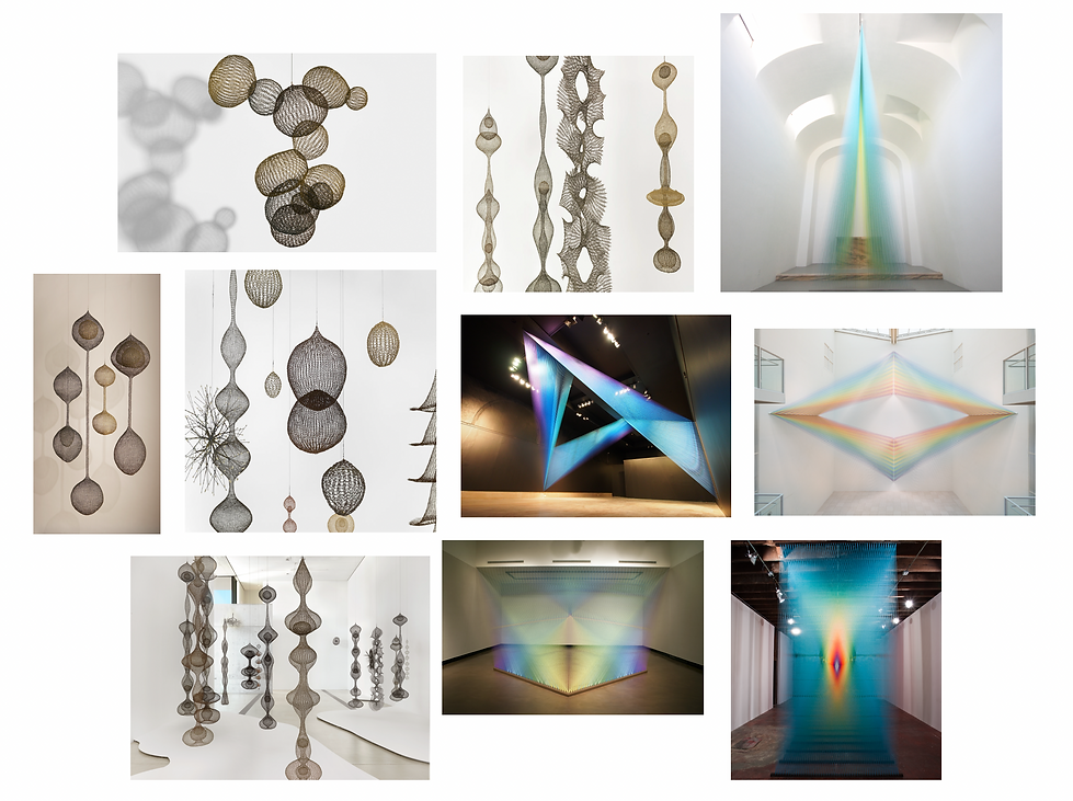
Ruth Asawa and Gabriel Dawe
Ruth Asawa’s suspended wire forms and Gabriel Dawe’s radiant thread installations shaped my thinking around line, light, and transparency. Asawa’s delicate structures suggest both interior and exterior volume, while Dawe’s work dissolves material into pure color and atmosphere. Their influence informed my approach to layering, tension, and rhythm—allowing the Yu Bag to exist between solidity and airiness, structure and softness.
Customer Profile

Customer Profile
Customer Board
The Yu Bag is made for curious, expressive individuals who enjoy experimenting with style beyond traditional gender norms. They are playful yet intentional—drawn to bold shapes, tactile materials, and unexpected details. With a love for art, design, and performance, they see fashion as a form of personal expression and creative freedom. Whether on city streets, at underground shows, or art school studios, they carry pieces that reflect their personality and spark conversation.
Brand Identity

Yu is a gender-neutral, experimental brand that blends fashion with sculpture and self-expression. It celebrates playfulness, individuality, and the freedom to move beyond traditional categories. Each piece is designed to feel both personal and conceptual—inviting wearers to engage with form, texture, and meaning in their own way.
The Yu logo is derived from the Chinese character 雨, meaning “rain,” which also connects to my own name. It represents softness, fluidity, and quiet power—echoing the brand’s values of emotional depth, transformation, and open identity.

Color Story
Material Selection
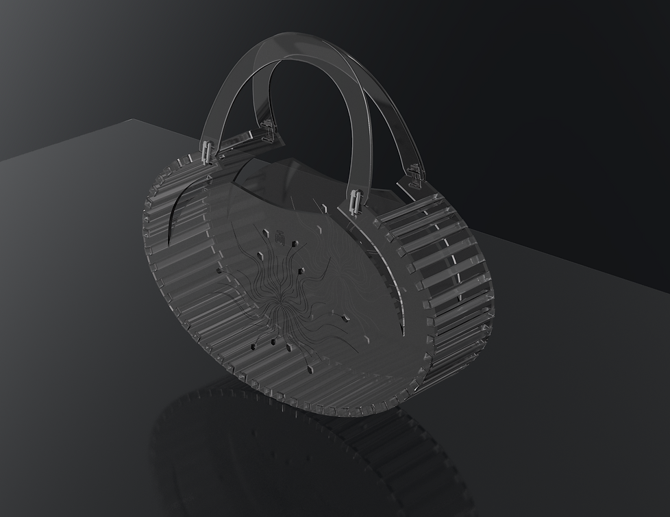
Materials were selected to create contrast between structure and softness. Acrylic was used for its transparency, rigidity, and clean edges—bringing a futuristic, water-like quality that echoes the jellyfish and underwater inspiration. A silver metal chain connects the handle to the bag, adding an industrial accent that contrasts with the organic feel of the form. Paired with soft fabrics and precise laser cutting, these elements come together to create a sculptural, dimensional piece that feels both experimental and wearable.

Design Line Up

Tech Pack Sample


Development Process
The first prototype was made using white opaque acrylic and yarn. The acrylic acted as the structural frame of the bag, designed with gear-like edges to create a bold, mechanical rhythm. Yarn was wrapped around the frame to soften the form and introduce tactile contrast. I also incorporated crocheted yarn and a soft inner lining to complete the interior. This initial version helped me explore the balance between rigidity and flexibility, as well as the dialogue between machine-like precision and hand-crafted detail.

While the first prototype created a clear contrast between materials, I realized that yarn wasn’t strong enough to support the structure of a functional bag. I started looking for a sturdier way to connect the acrylic pieces. In the wood shop, I tested using wooden sticks. I cut them into even segments and used them as connectors between the acrylic panels. This method made the construction more secure and practical while keeping the design simple and direct.


After testing the wooden sticks, I decided to move on from them. The opaque white acrylic felt too heavy and didn’t achieve the level of transparency I wanted. I switched to clear acrylic panels and began working with acrylic sticks instead of wood. I cut the sticks into even lengths and used them as connectors. This change kept the structure functional while creating a more unified and transparent look that better fit the concept.


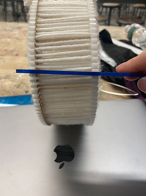
As I continued developing the design, I found an effective solution for joining the two acrylic panels. I kept the gear-like edge of the frame but enlarged it, then laser-cut matching acrylic sticks that fit precisely into the grooves. This created a clean and secure way to connect the panels without additional fasteners. With the structure resolved, I began introducing more color—selecting transparent acrylics that shift subtly under different lighting. These material choices added depth and visual interest while staying true to the original concept.


Photoshoot Concept
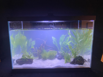
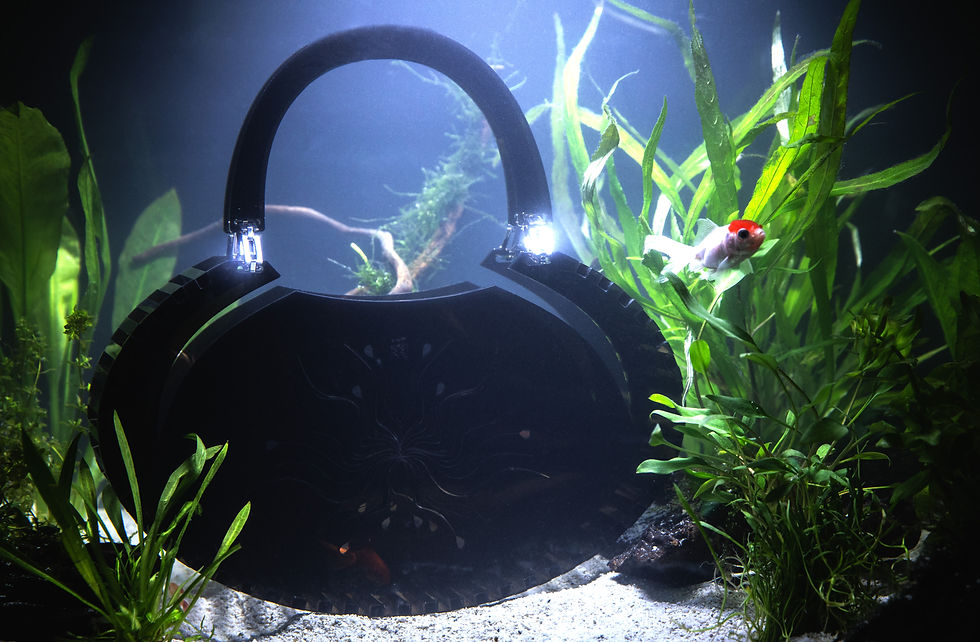
The photoshoot idea stems from the jellyfish and underwater inspirations behind the Yu Bag. I envisioned an aquarium-like garden, where elements like grass, wood, and flowing water create a soft, immersive world. Small fish and drifting plants evoke a sense of fluid movement and quiet surrealism. This environment mirrors the bag’s organic forms and layered textures, reinforcing the brand’s identity—playful, experimental, and deeply connected to nature in an abstract, sculptural way.


To bring the Yu Bag’s world to life, I created my own aquarium garden from scratch. I sourced a glass tank, arranged sand, plants, and natural textures, and introduced three goldfish along with a few small fish to animate the scene. This was my first time building a set like this, driven by the desire to physically recreate the dreamy, underwater atmosphere that inspired the design. The tank became a miniature world—fluid, surreal, and intimate—echoing the bag’s balance of structure and softness, playfulness and precision.